Websites have developed tremendously over the past few decades. With each passing year and new technological features, websites have gone from static, pixelated pages to immersive experiences.
For designers, 2020 promises to be an exciting year. Things have changed rapidly in the recent past, and the idea of the perfect website is evolving. Here are eight of the most popular website design trends for 2020.
Minimalism
Websites were once viewed as top-of-the-line if they had music and tons of content for browsing. However, as time passes, attention spans wither. Modern consumers like websites that take a more minimalist approach to design.
When you’re looking for an agency to revamp your website, look for one that prioritizes reducing user friction. In other words, one that makes it intuitive and simple for your user to find where they are going. A minimalist approach to design makes it easier for your audience to find the information they want without getting distracted. The cleaner look is captivating and not overwhelming in an increasingly noisy world.
The Saniswiss website exemplifies the minimalist design movement. Upon clicking to the homepage, you’re greeted with ample white space and soft text telling you precisely what the business does and why. It provides clarity and removes ambiguity and distraction. As you scroll, information is presented succinctly with white framing around each block for a full-screen effect. The overall look is clean, which ties into the business mission of manufacturing hygiene solutions.
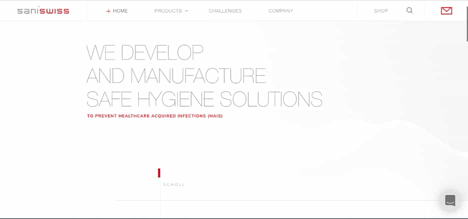 Screenshot: Saniswiss
Video Content
Video content also speaks to the decreasing attention spans of modern internet users. Furthermore, using video content gives a website an SEO boost.
Modern designers will need to investigate ways to include video content without detracting from the goals and messaging of a website. This design trend could mean finding the ideal way to frame embedded videos or creating a header that encourages browsers to keep exploring.
Custom Illustrations
After years of trying to get sleeker and more modern, design trends are shifting in the other direction when it comes to visual stimulation. Rather than stock photos that viewers have seen a million times before, hand-drawn, custom graphics and illustrations are going to make waves in 2020.
There’s something about the hand-drawn look that makes a business come across as more personal and human. The slight imperfections create a connection with potential customers, as opposed to the ultra-perfect streamlined graphics and imagery of the past.
The industry-leading meditation app, Headspace, is a perfect example of custom illustrations enhancing the brand and web design. The fun, approachable characters personify the website. Additionally, replacing stock images with imaginative characters makes the business more accessible– rather than being presented with an ideal customer, you can imagine yourself in the app.
This approach is used frequently in B2B websites; MailChimp, Basecamp, and Slack all use custom illustrations rather than realism in their design. These illustrations, paired with vibrant, inviting colors, convey information in a way that holds attention.
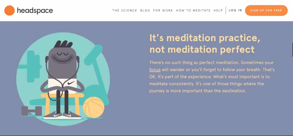 Screenshot: Headspace
Handwritten Fonts
Similarly to using custom illustrations, handwritten fonts were also impacting web design in 2020. Rather than using typefaces that emulate the more formal approach of Times New Roman or the modern look of Open Sans, designers are working with brands that use creative fonts. From brush strokes to graffiti style, these fonts can be a double-edged sword for designers.
Finding balance with custom fonts is a challenge. While the look can be eye-catching and provocative, they often become too busy with imagery or when used in excess. Finding a way to include this essential branding element without detracting from the user interface is a challenge that all designers will have to overcome in 2020.
Augmented Reality
One of the biggest challenges for online shopping thus far is the inability to try things on. Augmented reality is the hammer that will break down those barriers to create the e-commerce of the future.
Augmented reality allows users to try before they buy. Zenni is a brand that already does this with its glasses option, allowing users to upload a photo to “try on” their frames. Is another eyewear brand that has taken things to the next level with live augmented reality options.
With augmented reality in 2020 and beyond, consumers will be able to try on makeup or see how that bookshelf looks in their living room using a live camera. Think Snapchat filters for your online shopping.
White (and Dark) Space
Increased white space goes hand in hand with minimalism. Rather than having bold, branded backgrounds, designers are exploring ways to use smaller blocks and capitalize on white space. This helps reduce friction and makes the content pop. This approach to design is especially practical with lead magnet and opt-in forms, going for a full-page effect with no distractions.
While the logic is the same, designers are also using more dark space. Dark mode optimized websites use a black background for the content rather than white. This also creates a powerful contrast and invokes a sense of power and elegance that luxury brands love. The dark mode optimization also makes nighttime browsing less intrusive and more eco-friendly.
3D Animation that Pops
As creating an immersive experience is one of the overarching goals for 2020 web design, it should come as no surprise that 3D animation is becoming popular. Whereas augmented reality in web design brings a product to you, 3D animation allows the viewer to step into another world.
Formigari– an architectural design company– utilizes both the dark mode design trend in combination with 3D animation to create a captivating, sleek and elegant website that users find hard to resist. The 3D animation represents a moldable building block that shifts as the text overlay changes to describe the company’s mission. This complex design achieves the goal of holding the visitor’s attention for longer.
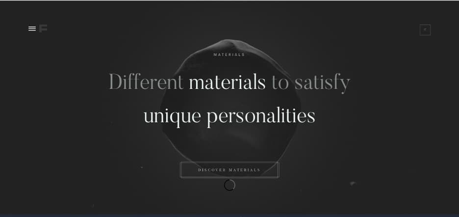 Screenshot: Formigari
Color Blocking and Layering
While many designers are hopping aboard the minimalist and white space bandwagons, others are taking their designs in a different direction with color blocking and layering. As mentioned above, Headspace uses color blocking to break up sections while scrolling. Other designers use various color blocks on a single screen to frame information and imagery.
Layering is another 2020 design trend that complements color blocking. The addition of shadows and overlap creates a moderate 3D effect without delving into the world of 3D animation. This effect is also a subtle way to bring pertinent information forward to make it stand out to the user without being obvious.
The Larry Ellison Foundation is a philanthropic organization that focuses on animal conservation, health, and education in third world populations. The homepage uses layered color blocking to convey the overall essence of the brand without being overstated. The designer took the layering to the next level by creating an animation that shows the layers being constructed, with transparency to see some of the elements beneath. This particular example showcases how designers can follow this trend with brands that prioritize subtlety and elegance.
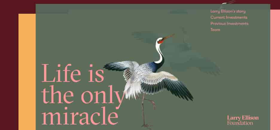 Screenshot: Larry Ellison Foundation
Final Thoughts
No matter what website design approach you take in 2020, go forth with one overarching priority: user experience. The better the user experience, the higher your conversions will be. While some of the trends listed here contradict others, many of these inspiring looks can be incorporated into a fresh take on tired designs.
Table of Contents