The easiest way to dodge renovation regret is to see your ideas in 3D before you buy paint, tile, or furniture. A few clear pictures—or a short video—of your own room can show how colors, lighting, and layouts actually feel, so you make fast, confident choices and avoid costly redos.
What is a 3D interior rendering (in plain words)?
It’s a realistic image or quick walkthrough of your room made from your measurements and photos. Unlike mood boards, it shows size, light, and how people move through the space. You can test two cabinet colors, swap a backsplash, or check if the island gives you enough room to pass by—without lifting a hammer.
Prefer not to learn software? A trusted 3d interior design rendering services partner can turn your notes and snapshots into clear visuals you can share with your contractor.
Quick wins to try in 3D first
-
Cabinets & hardware. Paint vs. stain, light vs. dark, knobs vs. pulls. You’ll see the mood change instantly.
-
Counters & backsplash. Check if a bold slab or patterned tile steals the show—or ties everything together.
-
Lighting. Test pendant height over the island or table and add under-cabinet strips to remove shadows.
-
Layout & storage. Make sure doors don’t hit each other, stools have legroom, and daily items sit within easy reach.
-
Color confidence. Try your top three wall colors in a morning scene and an evening scene to avoid undertone surprises.
What to send to get started (no perfection needed)
-
Measurements: room length/width/height; window/door sizes; ceiling slopes if any.
-
Photos: one from each corner, plus a wide shot from the hallway or next room.
-
Keep vs. change: floors, fireplace, built-ins, appliances.
-
Inspiration: 4–6 images that show the feel you want.
-
Top 3 questions: e.g., “Is the aisle wide enough?”, “Which cabinet color?”, “Does the room feel cozy at night?”
This little packet keeps the process quick and focused.
How the process usually works
-
Kickoff (short call or email). Goals, views, and timing.
-
First pass. Simple shapes and camera angles—just to confirm size and story.
-
Look & light. Add finishes and day/evening light so it feels like your home.
-
Finals. You get polished images and (if you want) a calm, 20–60s video.
Most people only need two rounds: one after the first pass and one after the look-and-light stage.
Files that actually help on project day
-
A few “hero” pictures. Perfect for comparing options and making a shopping list.
-
Detailed close-ups. Where tile turns a corner, how a handle sits on a door—great for installers.
-
Day + evening views. Your home lives in both; check that it feels good at night too.
-
Short walkthrough (optional). A simple “arrive → reveal → details → exit” video helps get family buy-in.
Room-by-room ideas to test in 3D
Kitchen
-
The squeeze test. Render the island with the dishwasher open and a person passing behind. If it looks tight, it is tight.
-
Vertical balance. Make sure hood width, upper-cabinet height, and window trim feel even.
-
Stool spacing & legroom. Choose once, not twice—renders make comfort visible.
-
Open shelves vs. uppers. Try both and see which makes the space calmer.
Bathroom
-
Tile size and layout. Stacked vs. staggered grout lines change the look of a small shower.
-
Mirror + sconce spacing. Eye-level views show whether faces are lit, not just foreheads.
-
Storage choreography. Confirm tower doors, clear faucets and niches don’t collect splash.
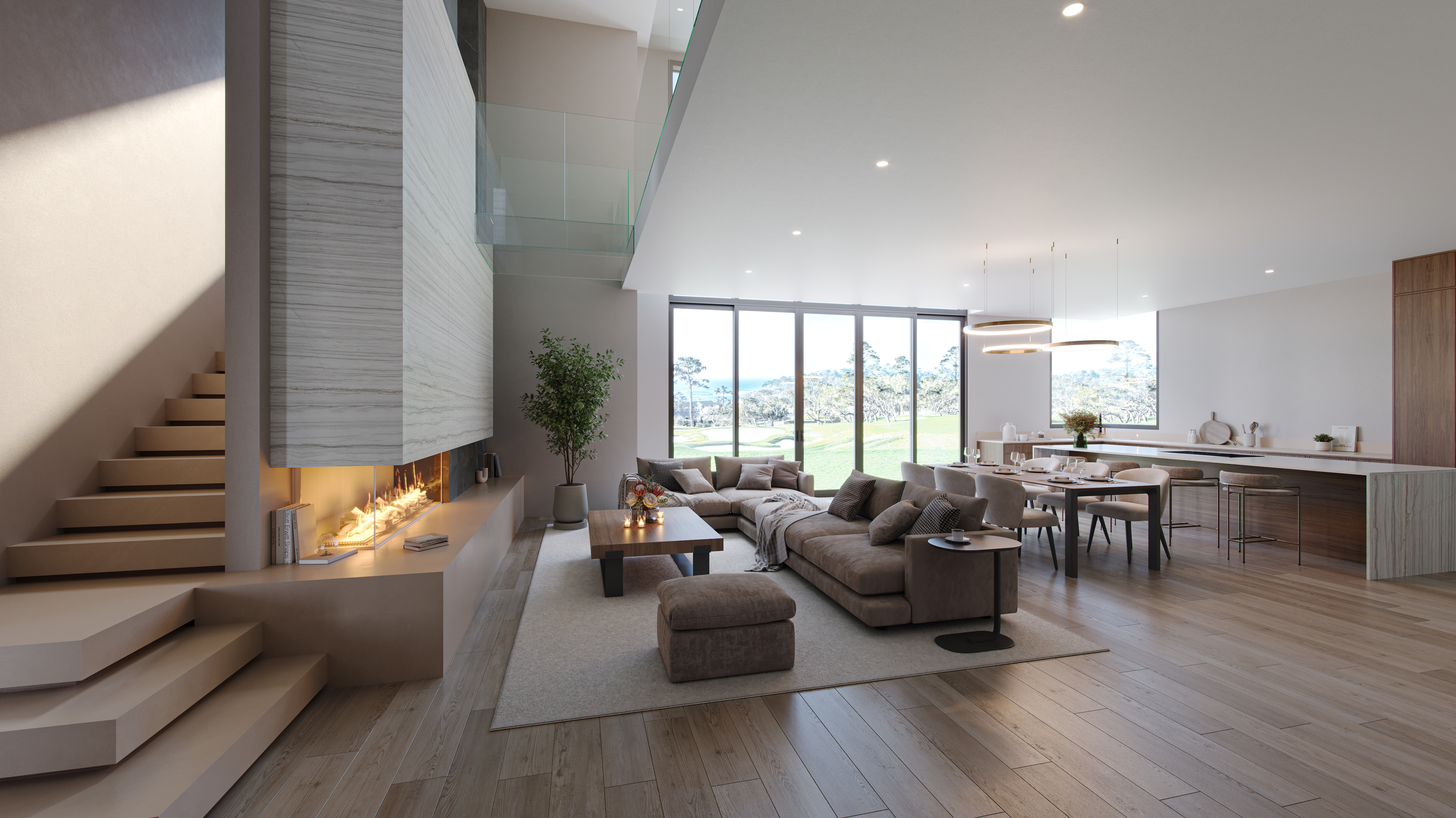
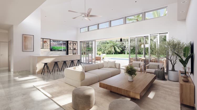
Living + dining
-
Rug and sofa scale. Front legs on the rug is a good starting rule—check it visually.
-
Pendant height. Compare 30″, 32″, and 34″ above the table and pick what feels right from every seat.
-
Traffic flow. Make sure paths between kitchen, table, and sofa are clear.
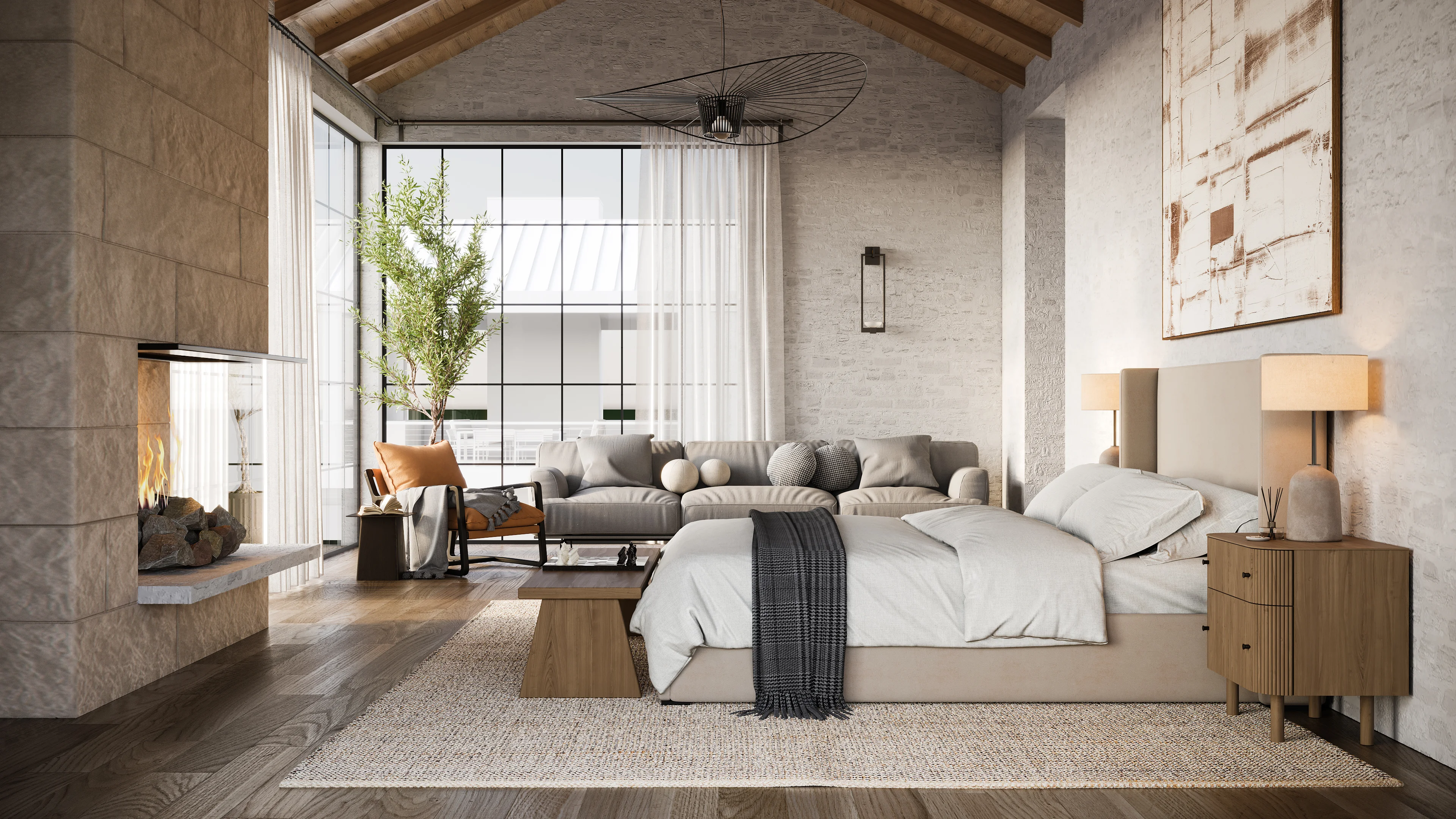
Bedroom
-
Calm lighting. Test warmer lamps (2700–3000K) in a dusk scene to see if the room stays cozy.
-
Bed wall options. Centered symmetry vs. a single pendant and art—try both.
-
Storage basics. Check closet door swings against dressers and benches.
Lighting made simple
-
Layer it. Mix ambient (ceiling), task (under-cabinet, desk), and accent (sconces).
-
Watch glare. Night scenes reveal if pendants reflect on glossy counters or screens.
-
Match the mood. Warm bulbs in living spaces, brighter task light where you work.
Color and materials: easy rules that work
-
Test in two lights. Morning sun and evening lamps can make the same paint look different.
-
Balance bold and calm. If the backsplash is loud, keep counters or cabinets quieter.
-
Real-world textures. Ask for wood grain and metal sheen that look natural, not plastic.
Storage that feels built for you
-
Pull-outs and dividers. Plan for baking sheets, pots, spices, and trash from the start.
-
Hidden helpers. Slim pull-outs near the range, a tray slot by the dishwasher, a shallow drawer for everyday tools.
-
Pantry logic. Set shelf heights to real items (cereal boxes, small appliances, bulk bins) so it stays tidy.
Small-space tricks that 3D makes obvious
-
Go vertical. Taller cabinets, higher curtain rods, and stackable storage pull the eye up.
-
Mirror smartly. A well-placed mirror expands a narrow hall or small dining zone.
-
Keep the floor clear. Wall-mounted hooks, floating shelves, and slim consoles make rooms feel bigger.
If you rent (and can’t remodel)
You can still use 3D to plan non-permanent upgrades:
-
Color and light. Try peel-and-stick wallpaper, plug-in sconces, and warm bulbs.
-
Furniture layout. Avoid buying a sofa that’s too deep; check clearances first.
-
Storage add-ons. Freestanding shelves and rolling carts that actually fit the space.
-
Rugs and curtains. Right-size them in 3D so returns are less likely.
When you move, take the plan (and the portable pieces) with you.
Family decision-making without the drama
-
Pick two versions. A “safe” and a “bold” option keep choices simple.
-
Set a decision date. Watch both over breakfast and at night, then vote.
-
Agree on must-haves. For example: “quiet evenings,” “easy cleaning,” “clear counters.”
-
Use feelings, not jargon. “Feels heavy,” “too shiny,” “warmer, please” is enough.
Common pitfalls to avoid
-
Endless fly-throughs. You don’t need drone shots; eye-level views tell the truth.
-
Too much brightness. Super-bright scenes look fake. Ask for normal daylight and a cozy evening look.
-
Guessing on sizes. If something still feels tight on screen, it will feel tight in real life—adjust before you buy.
-
Changing five things at once. Switch one big element per round so you can tell what helped.
Budget-friendly ways to use 3D (even for small tweaks)
-
Paint + lighting refresh. Test three paints with warm vs. cool bulbs; you’ll see the winner.
-
Rug + coffee table swap. Check size and shape so the living room finally feels right.
-
Entry reset. Try door color, hardware finish, and a wall hook layout in one pass.
-
Gallery wall. Lay out frames at scale before drilling a single hole.
How to give feedback (so rounds stay short)
-
Say what you feel. “The island looks heavy—can we thin the edge or open one end?”
-
Change one big thing at a time. Cabinet color or backsplash, not both at once.
-
Point to the moment. “At 9 seconds the pendant feels too bright—can we soften it?”
-
Pick winners. When you see A/B options, choose one on the spot—momentum helps.
Clear notes = faster decisions.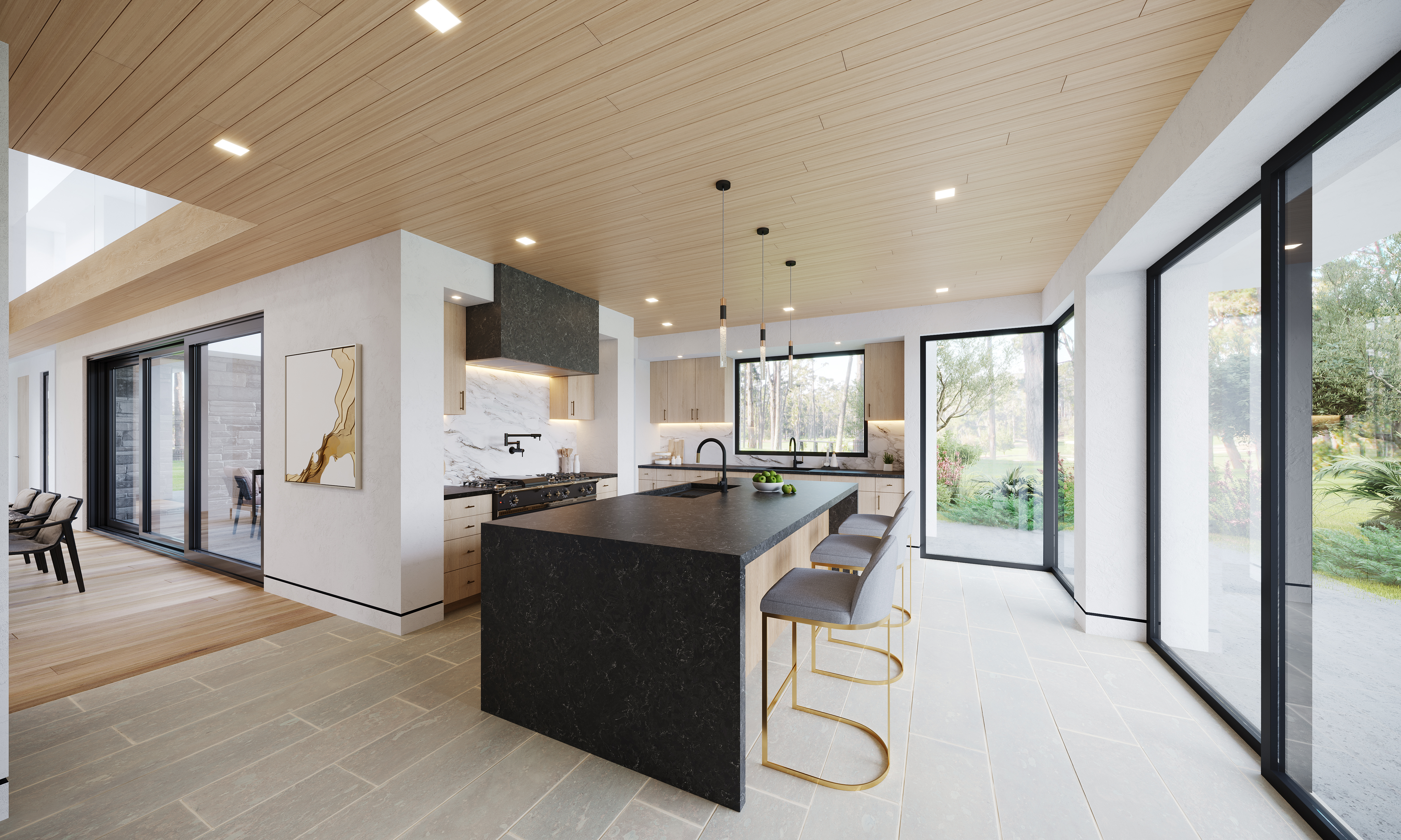
From picture to project: bridging the last mile
-
Save detailed crops. Tile corners, trim ends, mirror/sconce spacing—installer gold.
-
Add simple notes. Centerlines and heights on a basic plan remove guesswork.
-
Keep a one-page spec. Paint codes, hardware, fixtures—so the real room matches the picture you loved.
-
Share one cloud folder. Everyone (family, contractor, installer) works from the same images and updates.
The takeaway
Seeing your plan in 3D is like trying on clothes before you buy them. With a handful of measurements, a few photos, and clear goals, you can choose colors, lighting, and layouts with confidence—and start your upgrade knowing it will look and feel right the first time.
Table of Contents